Redesigning for Clarity: Philippine Dermatological Society’s Homepage
A homepage is more than just a digital front door — it sets the tone, guides user actions, and builds trust. But when navigation is clunky and priorities are unclear, users get lost.
Whether to join the dermatology community or find a qualified expert. But the homepage wasn’t making it easy. With unclear navigation and competing priorities, users struggled to take the next step. Instead of guiding users, the site left many unsure what information to look for
About
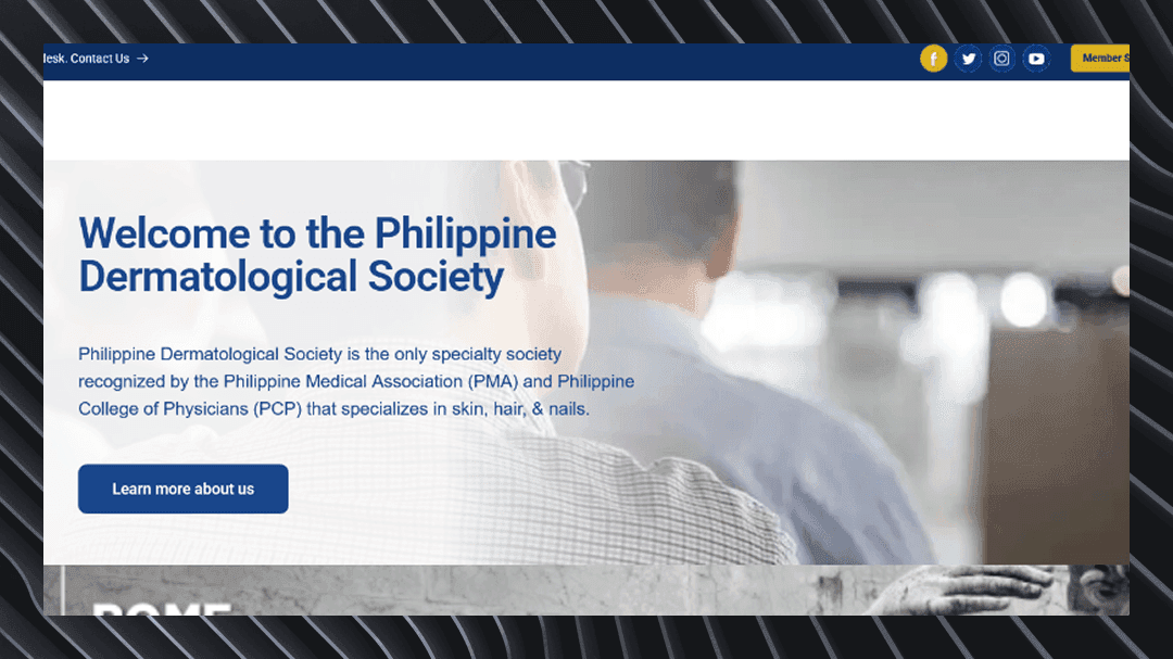
The PDS homepage serves as the main platform for connecting dermatologists across the country and guiding patients toward trusted, board-certified professionals. It also promotes society events, shares updates, and facilitates membership applications. However, its current structure limited its ability to deliver these goals effectively, both functionally and visually.
The Challenge
PDS aimed to do two things: boost membership sign-ups and make the site more user-friendly. They had the goals—but not yet the roadmap. A major challenge was trying to serve both dermatologists and patients equally on the homepage, which blurred the site’s focus and made navigation harder.
The priority became clear: refocus the homepage around a single, purposeful experience—while maintaining credibility and functionality.
Key Problem Areas
Low sign-ups caused by weak, hard-to-find CTAs.
Confusing navigation due to cluttered menus.
- Poor content structure hiding important information.
- Events and announcements lacked visibility and clear presentation.
The Design Approach
We addressed the core challenges PDS was facing by pairing each problem with a targeted design solution:
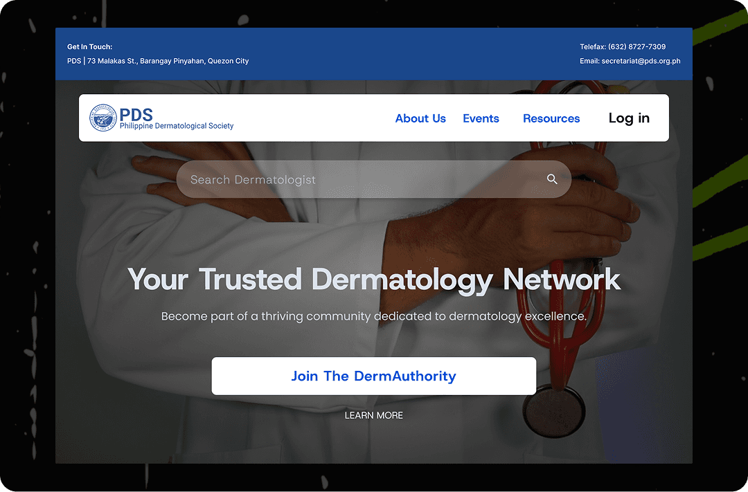
A. Hidden or Weak CTAs
- Problem: Membership sign-ups were low because calls to action were not visible or compelling.
- Solution: Designed a bold, eye-catching hero section with a clear, inviting “Join the DermAuthority” button — making the site’s purpose instantly clear.
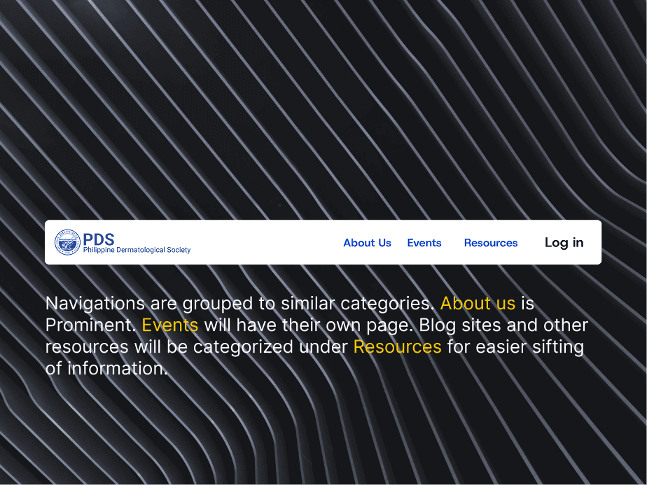
B. Cluttered Navigation
- Problem: The navigation menu was overwhelming and confusing for users.
- Solution: Simplified the menu by logically grouping related items and removing clutter, making it easy for visitors to find what they need quickly.
C. Poor Content Organization
- Problem: Important information was scattered and difficult to locate.
- Solution: Restructured content into clear categories with a strong visual hierarchy to guide users naturally through the site.
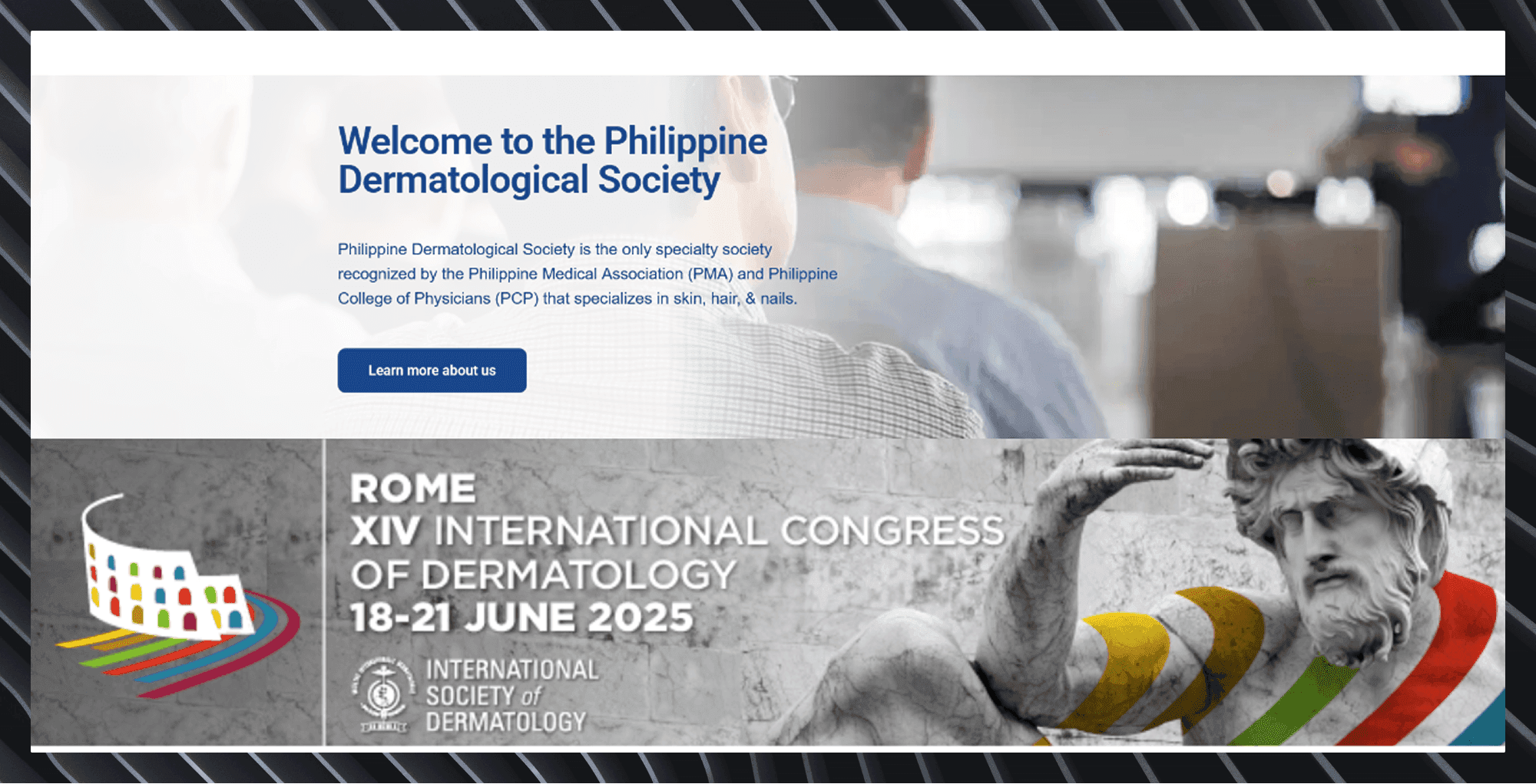
D. Events and Announcements Lacked Visibility
- Problem: Event banners failed to stand out and clearly communicate key details.
- Solution: Redesigned event banners to counter banner blindness — using integrated, content-like visuals with clear headlines and consistent placement to make them feel native and noticeable.
Quality Of Life Improvements
- Responsive design optimized for all screen sizes
- Streamlined sign-up flow with visible CTAs
- Professional, clean visuals that build trust
- Clickable event cards redesigned for clarity and relevance
- Better accessibility support for diverse users
Key Takeaways
- A website with multiple audiences must prioritize and balance its goals
- Clear structure and CTA hierarchy are key to driving engagement
- Educating clients fosters stronger design collaboration
- Strategic features (like the search module) add value without distraction